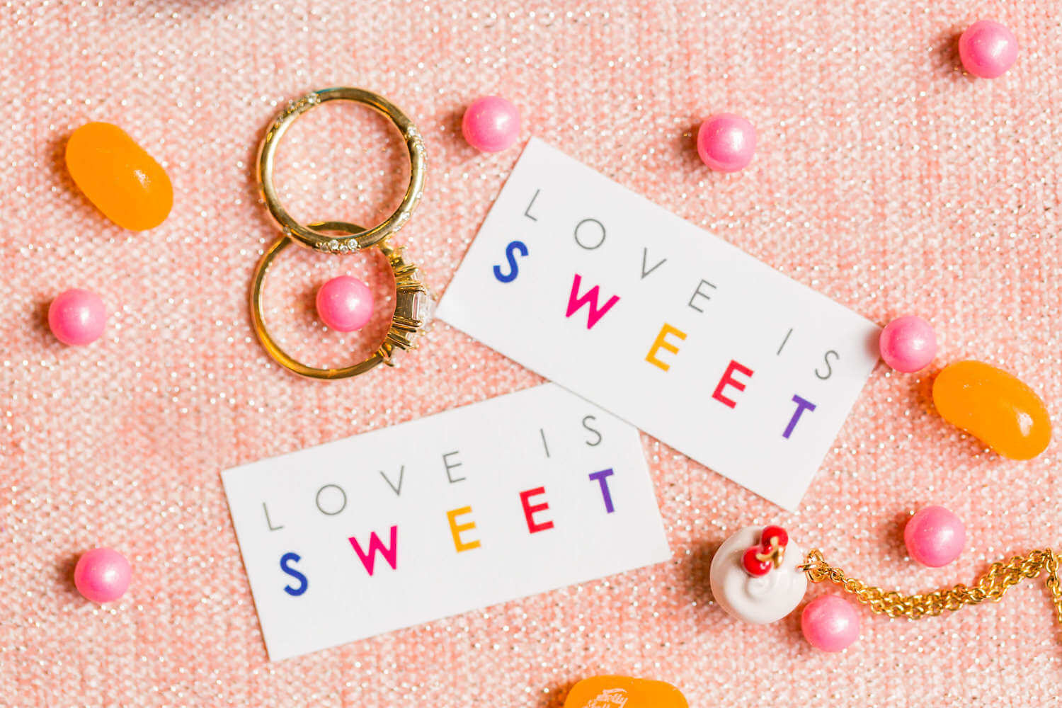
Love is Sweet- Colorful Styled Editorial in New York by Color Pop Events
Brianna Kozlarek / Tuesday January 26, 2021
Happy Wedding Wednesday! In our first feature of the year we are so excited to share this colorful styled editorial by one of our favorite wedding planners Color Pop Events. The “Love is Sweet” shoot is filled with all the love and color and is the perfect way to kick off our #perfete year. If you’re looking for vibrant, modern, wedding inspiration, look no further and scroll to swoon.
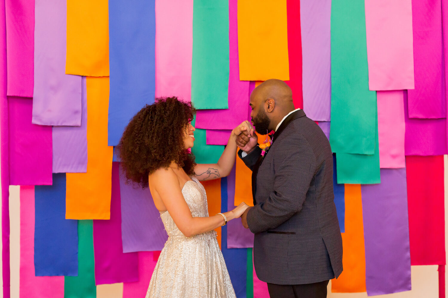
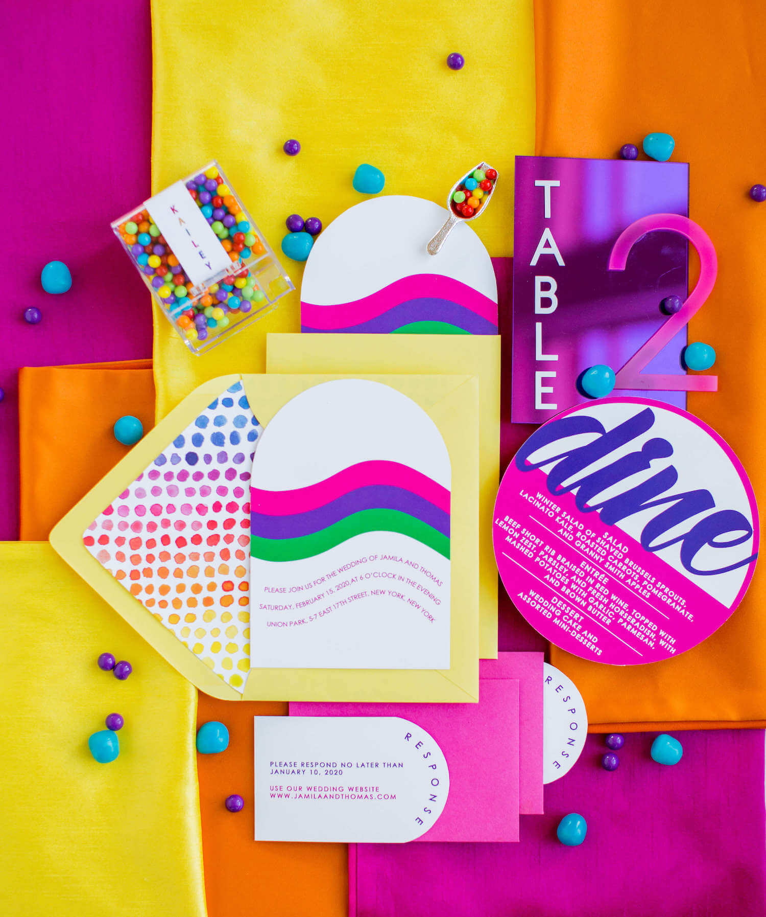
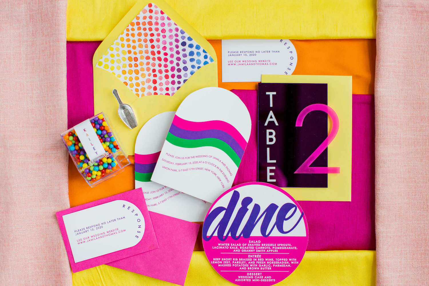
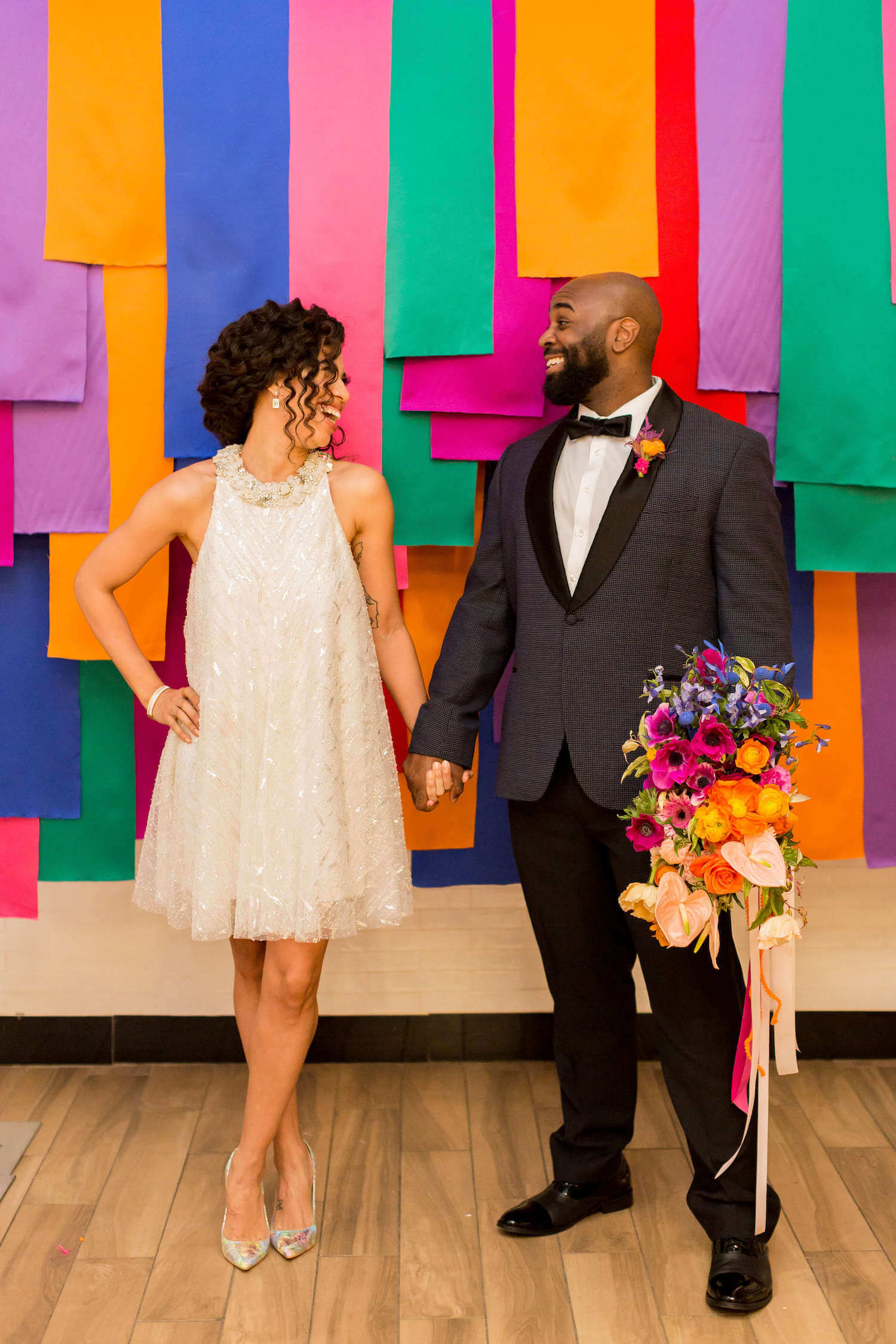
How did the idea originate and what were the must-haves or things you knew you wanted to include? Anything about the inspiration is great! The idea was actually inspired by a colorful croissant from a bakery here in NYC. Rose from Flower Peach Floral approached me about doing an editorial together a couple of years ago and had sent over a few mood boards with ideas she had. Timing wasn’t right to work together at that time, but one of the mood boards stuck with me and it had a photo of this croissant. Then, in 2019 when Jessica was visiting NYC, we talked about doing another editorial together because we love working together and make a stellar team. So I showed her a photo of the croissant while we were at brunch and she was sold! Because a croissant inspired the whole idea and because I am a HUGE sweets person, I wanted to do a colorful, over-the-top sweets and dessert-focused wedding celebration. Basically one little croissant inspired our color palette, the dessert theme, and the stripes design that was incorporated into our ceremony backdrop and the wedding cake.
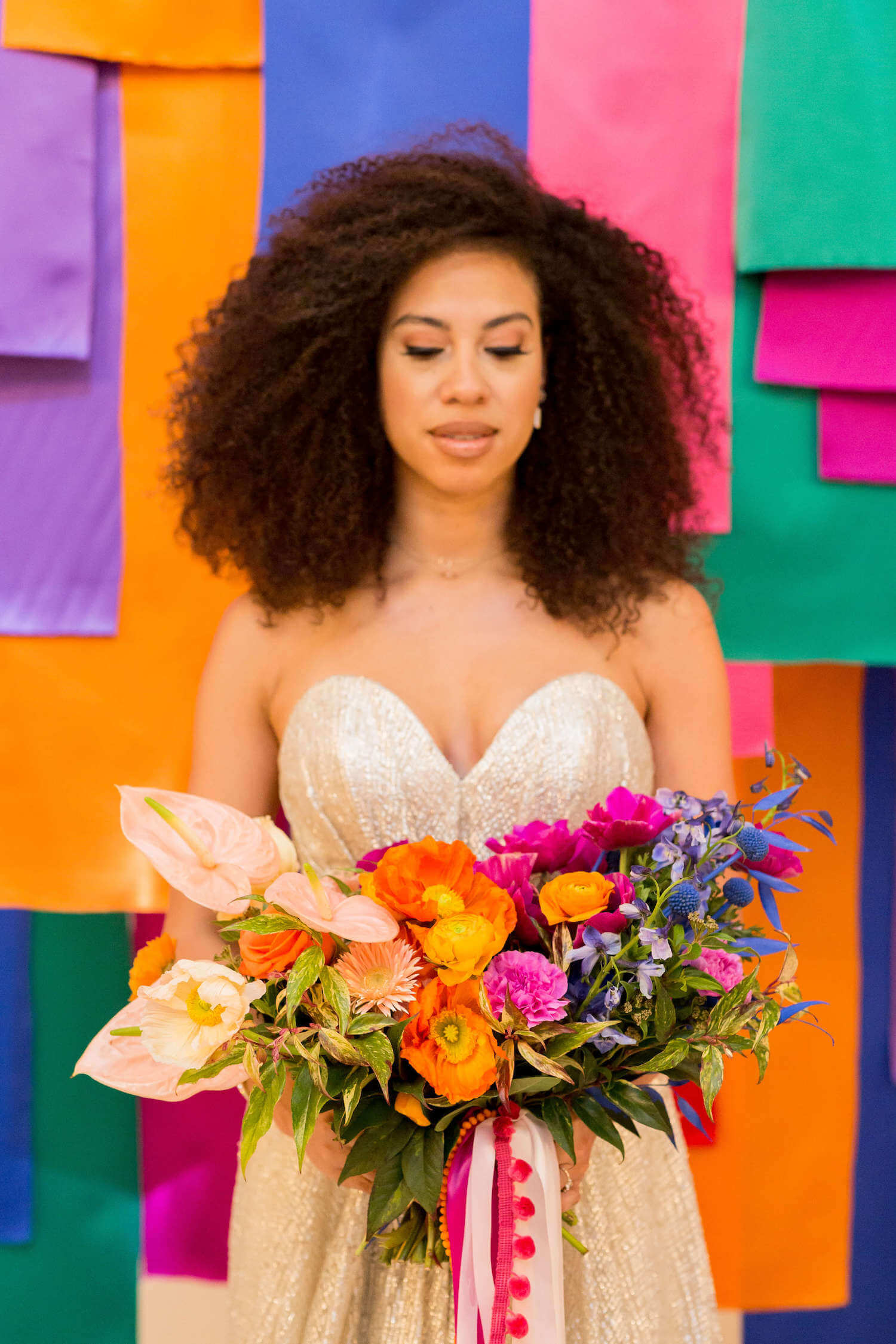
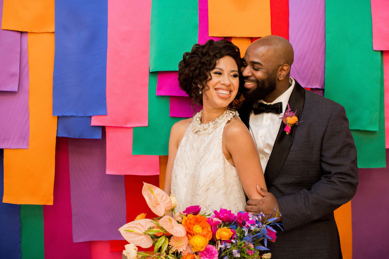
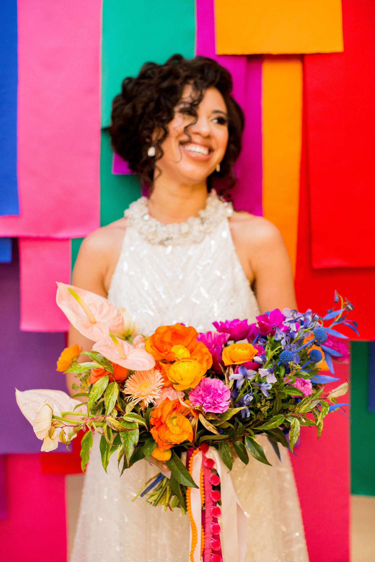
Rainbow as a color scheme can be tricky to pull off… what are some tips to achieving a good mix of hues and a good balance? In 2017, I actually had a rainbow (like red, orange, yellow, green, blue, and purple) wedding (you all actually published it!) and the concern when designing that wedding (and of the couple) was to make sure that it felt like a wedding and not a bar/bat mitzvah. Step one was to have the right space for such a strong color palette. The venue they chose was a fully white, raw space, so any color we added would not be competing with anything else. We kept the linens all white and went with clear ballroom chairs for seating. With everything else being white, it allowed for the ceremony backdrop to pop and the centerpieces to be the focal points without having the entire room drenched in color. There were pops of color in other elements, like the paper goods and a sign with the couple’s initials, but the color was used intentionally, thoughtfully, and somewhat sparingly, which is the key. I was lucky with that wedding to be collaborating with a talented designer/maker (Michelle Edgemont) who was also cognizant of making sure that everything looked like a wedding and not a birthday party.
If a couple isn’t working with a professional designer and if they aren’t necessarily very strong designers themselves, then one of my big tips would be to NOT use the traditional rainbow color palette if they want something colorful. If you’re not careful, the traditional rainbow colors can make an event feel juvenile. So if you’re tackling an event on your own, my recommendation would be to use different shades of the rainbow colors (like we did for the Love Is Sweet editorial), because that will give you a safer place to start from but still give you the color you crave.
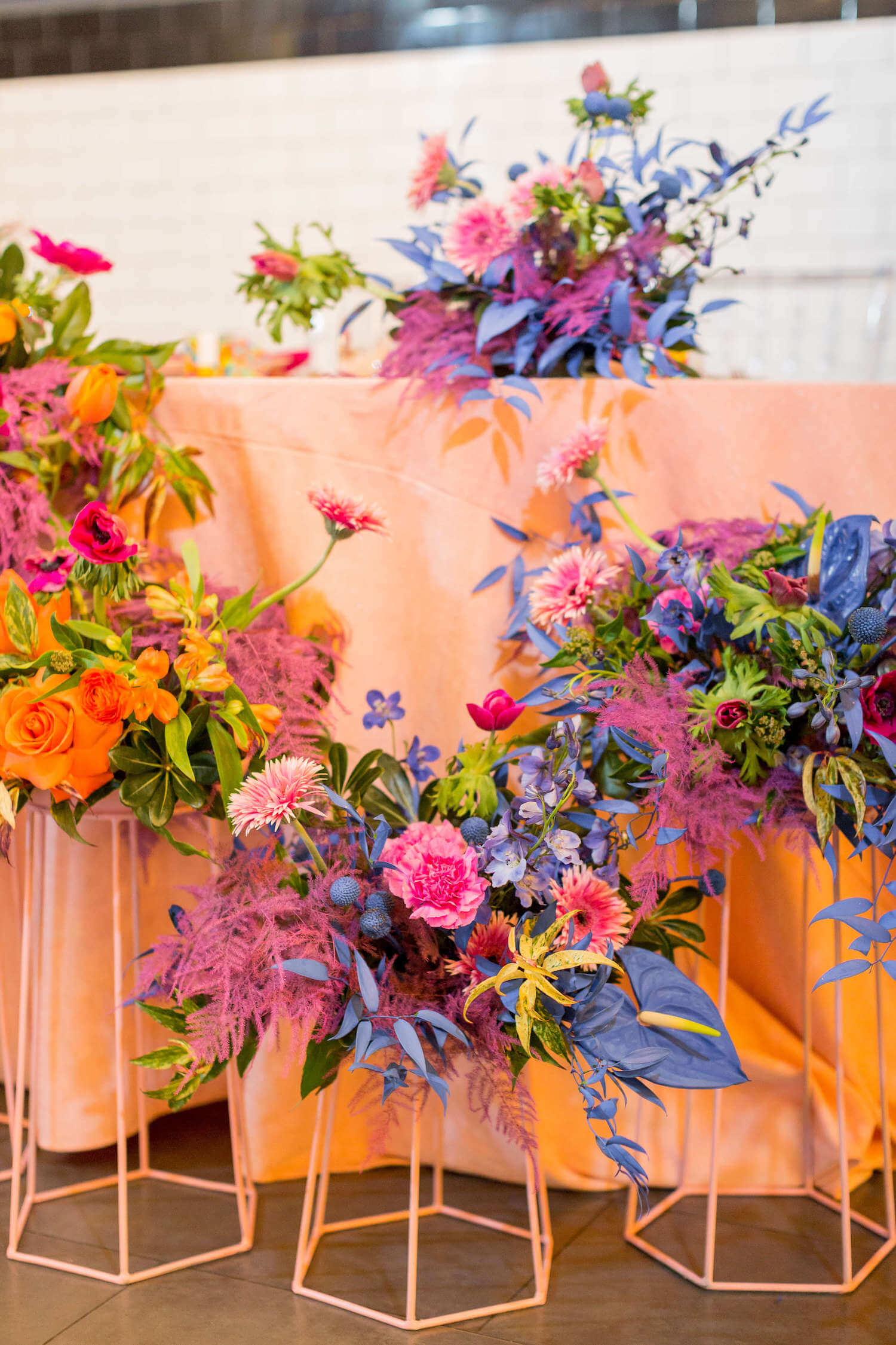
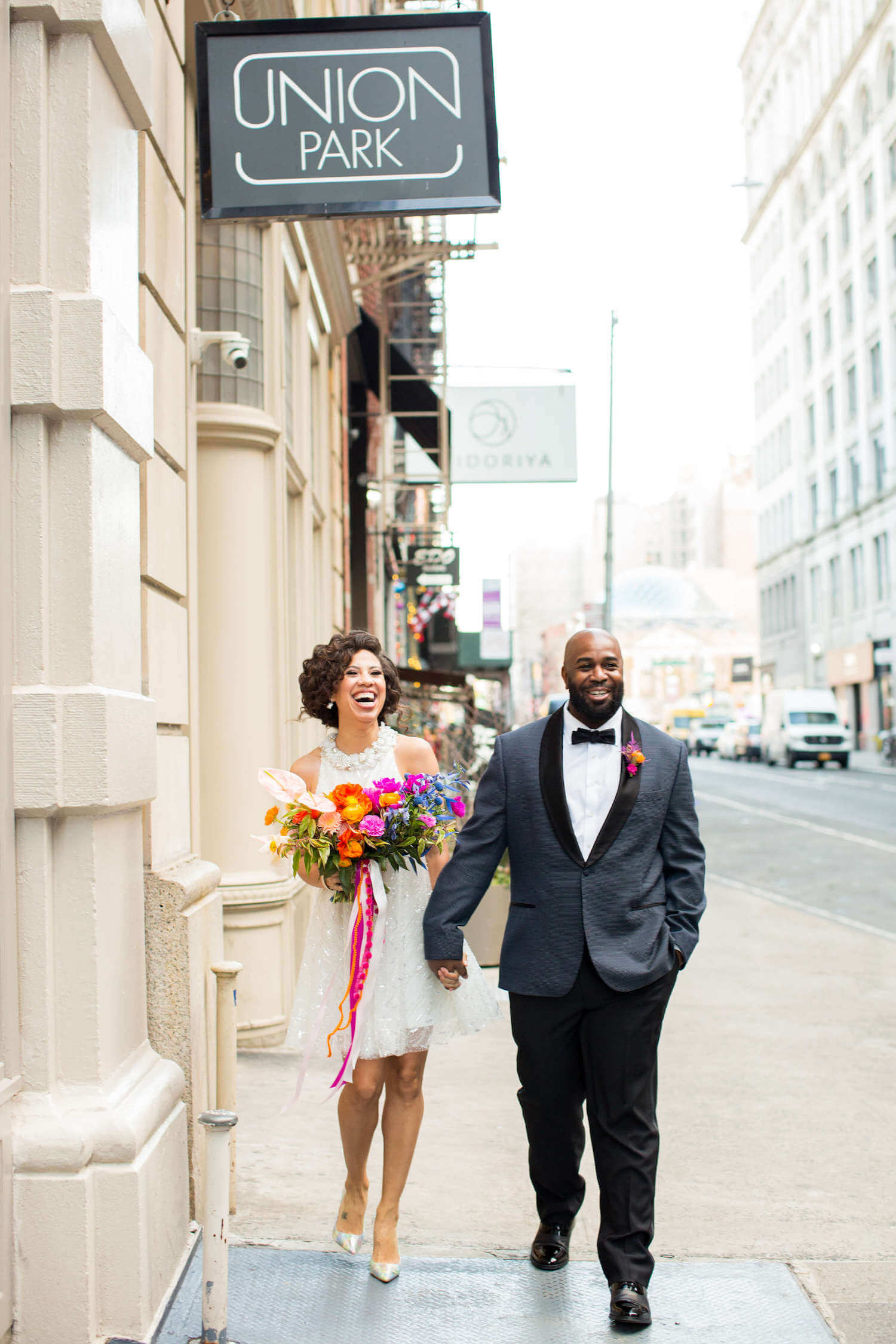
Love the way the table centerpieces are continued in raised arrangements near the base of the table. Can you speak more about this idea? We wanted to create three different tablescapes (2 dinner tables and 1 sweetheart table) in order to show a variety of design ideas. When it came to the raised arrangements, I had asked Rose whether we could do tall arrangements but in a “swoopy” shape inspired by the shape of a lot of balloon installations I’ve seen. She responded that she had actually been pitching the same idea to her couples but calling it a “caterpillar” shape. Great minds think alike! So we showed what that style would look like across a traditional rectangular dinner table and then repurposed the arrangements for the sweetheart table. It added a TON of visual interest to the table but since the arrangements were on the floor, didn’t block the line of sight of the couple. It’s a great way to decorate a sweetheart table without overwhelming the couple sitting there.
The dessert table is epic! What led the way, color? And what’s the secret sauce to achieving the “more wedding” “less birthday party” vibe? The color palette for the dessert table stemmed from the croissant that inspired the entire editorial. One of the keys to make the cake more wedding and less birthday party is to still keep it mostly white so that you have that sophisticated and “wedding” feel. Had we covered the entire thing in the colorful stripes, I don’t think it would have had the same effect. Having the white wall behind the dessert table and using a white linen kept the crispness and high end feel, while helping the colors to pop. Had we used a linen with color or placed the table in front of a busier or more colorful backdrop, it would have taken away from the chicness of everything. So I guess the moral of the story is to make sure you’re editing the look and not just throwing as much color as you can into something.